March 2025
Text: Alexandra Hörtler; Fotos: in the headroom
In spring 2024, we were invited by the KHM-Museumsverband,to participate in the competition for the special exhibition "Who’s Wearing the Pants?” at the World Museum Vienna.
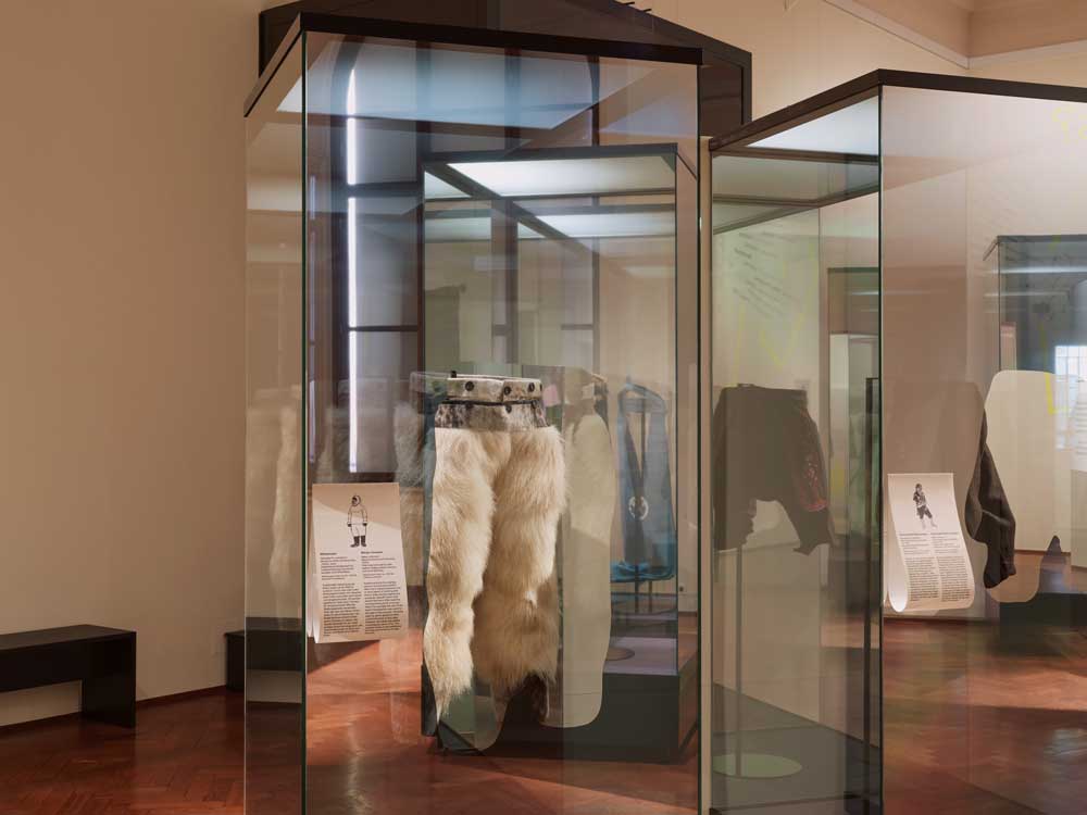
The core of our design concept is the ideal showcasing of the variety of original exhibits. The presentation of items is complemented by a modern, light, and bold exhibition design that deliberately plays with contrasts, utilizes the formal language of the central object – the pants – and creates humorous moments.
Bold Design with Neon & Mirrors
A central design element is semi-transparent mirror films with cutouts in the shape of the pants exhibited behind them. The cutouts direct visitors' gaze and place their own self in context with the exhibition object.
Another design gimmick is the concept of "walking pants": mirrors in the lower area of room texts draw attention to visitors' own pants as well as those of others - making them an integrated part of the exhibition. One's own reflection becomes part of the staging.
This theme is further enhanced by the selfie station that dresses up as a "Virtual Dressing Room": Visitors see themselves and their surroundings on a large screen as if looking into a mirror. With simple gestures, they choose between different digital pants models and "put them on" over their mirror image. The resulting images can be loaded directly onto smartphones via QR code and shared.
We used color as bold statements, precisely: neon colors – both in the guidance system and as decorative color in the respective rooms, extending to the covering of the often-unloved cable ducts.


A seven-meter-high pair of pants greets visitors as they enter the columned hall of the World Museum. The former shop is also quickly transformed into exhibition space: Three-meter-high DropPaper tabs display a selection of pants from the museum's collection.
We place special emphasis on the design of all text elements – texts introducing a room, an area, and an object. It is important to us to choose a sufficiently large and easily readable font as well as printing on a light background to achieve good contrast. The object texts are also made from DropPaper – contrary to the common practice of cards on the wall – and in the form of tabs reaching out to visitors.


Inclusion & Accessibility
Our goal is to create a modern, interactive, and accessible exhibition experience for a wide audience. We are guided by current standards in the fields of inclusion and spatial design.
We implement the following measures:
- Maintaining sufficient passage widths for wheelchair users and people with strollers
- Blanced lighting while taking conservation requirements into account
- Regularly placed seating options
- Large-scale, high-contrast labeling
- Multi-sensory mediation through tactile objects and audio stations
This comprehensive approach enables broad participation and enhances the quality of the exhibition experience for all visitors.
Sustainability
Since 2012, we have been certified as a "Green Agency" and awarded the Austrian Ecolabel. We are aware that temporary exhibitions are generally associated with increased resource use. Therefore, we consistently pursue the goal of designing exhibitions as sustainably as possible.
Specifically, we focus on:
- Reusing existing display cases, fixtures, object label panels, and media stations
- Durable and recyclable materials such as mirrors or DropPaper
- Modular design of new elements for reuse
- Energy-efficient technology solutions such as standby mode for media stations
- Double usability of display case fabrics thanks to overlapping
These measures allow us to combine an innovative exhibition concept with ecological responsibility – and thus make an important contribution to sustainable practices in the cultural field.
Award
Planning phase: eight months | Performance phases: LPH/PPH 1 – 7 | Completion: March 2025 | Realisation media station: Vienom OG | Client: KHM Museum Association / World Museum Vienna


